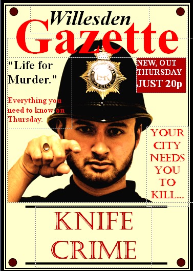
In what ways does your media product use,
develop or challenge forms and conventions of real media products?
Newspaper:
Mastheads, skylines, straplines,
headlines, white on black, bylines, body text, sidebars, menus, pull quotes,
puffs and captions are all typical codes and conventions that real newspapers
follow, especially on the front cover. My local newspaper’s masthead is bold
and large and therefore able to catch the audience’s eye and get them
interested in my newspaper, including the date, website and price. Through
research into real products, the masthead noticeably covered a quarter of the
space on the front cover. Similarly, I applied this convention into my
newspaper. The title represents the newspapers identity and personality. I
rejected the traditional icon of black on white (typically broadsheet) or white
on red (typically red-top tabloid) and went for a mixture of the two to
symbolise a mid-market touch to the newspaper (although it’s mainly for the
lower middle class/higher working class: “Willesden” being black on white and
“Gazette” being red on white. Analysis of a range of local newspapers
constructed the title of my newspaper. It is almost impossible to find a local
newspaper without its local area name in its masthead, hence, the construction
of “Willesden”. Local newspapers follow a sans-serif typeface in their title
and masthead to connote informality and news stories and captions follow a
serif typeface of an equal and small font. Likewise, my title and masthead was
of an aerial font and the rest was times new roman.
Additionally
the term “Gazette” adds this journalistic flare to the whole personality to the
newspaper. Developing a headline introduces the title of the lead story or
splash. This is usually carried out in a condensed black font. However the
white on black effect allowed dramatic emphasis on the story. It is something
unusual for the audience to witness, so therefore will definitely be intrigued
as to what the story is about. The headline itself, “Life for murder”, is very
simple but damaging. I had purposely created this convention because big news
stories in local newspaper follow the same convention. An additional strapline
gave a taste of what’s to come in the story which is a modern convention as
well as a byline (in bold type), indicating its authenticity to the story.
Furthermore, a sidebar column separated from the main body text, allows viewing
for short teaser stories on inside pages or news in brief. An example of this is
a sneak peak of a headline in the sidebar “onions for laptops”, followed by a
teaser story.
Furthermore
I used and developed the images/photographs of the three Afro-Caribbean males
on the front page, with an additional caption of their names below. Although it
was difficult, I managed to glamorise the images itself without editing it
through the connotations of their facial expressions. Pulling of a symbol to
the audience, we as consumers are intrigued and attracted to such intimidating
but yet “I don’t care” images. Through the majority of mug shots in local
newspapers, the connotations I had found in these photographs is that the
individuals have this “I don’t care” look. And the captions/names below the
murderers add a sense of reality.
Furthermore,
through research the local newspapers I analysed followed a format of a
tabloid-sized newspaper (approximately 23 *43cm) consisting of 5 columns for
the front cover and 6 columns for page 2. During the research I had come across
some design tips that helped me develop the conventions I created.
·
All
story packages should be should be shaped like rectangles (all my news stories
on both pages follow these codes).
·
Every
page should have a dominant photo or artwork (on the front cover, the 3 Afro-Caribbean
males and page 2, the class and the teacher).
·
Every
story must have a headline (essential standing element that my newspapers
covers where every news story is followed by a headline)
·
Every
photo must have a caption (again an essential standing element my newspaper
covers as there is a caption for every photo)
·
Use
no more than three typefaces per page, including the typeface in the nameplate.
·
Headlines
should get smaller as you move down the page (local newspapers, especially
after the front cover have one main dominant news story consisting of a main
headline and photo. The other headlines and news stories surrounding are much
smaller in size)
Although
local newspapers have strong advertising services, I deliberately kept the size
and number of advertisements as minimum and as small as possible, as the
examiner prefers us to show of our journalism in news stories, hence why I
created one hair and beauty advertisement on page 2. However, advertising is
large part of a local newspaper which drives local businesses and is a
convention of real products. Sometimes it even covers half of the front cover
and page 2 such as the Harrow Times. In terms of the “missing person”, “contact
us” and “Gazette weather”, again I kept it as minimum as possible taking up ¾
of a column. It is still a typical week in and week out convention that most
local newspapers follow. To make my newspaper look more realistic and not just
covered with a splash of news stories, these conventions were part of the page
2. The opinion poll about “rising fare” on page 2 is again another convention
that some local newspapers abide to so I managed to interview 5 people about
their opinions. In terms of news stories itself, from following real products
front covers typically seem to contain one very dominant story or one dominant
and a lesser dominant story next to it. On page 2, there are a variety of 3-4
news stories in real samples so I similarly applied 5 news stories to my
product.
Please note there is an audio presentation of evaluation question 1 on the CD