Saturday 14 April 2012

A Poster for my Local Newspaper

To start constructing my poster for my local newspaper, I needed a clear understanding of how the ideology, representation and genre are conveyed in advertising their newspaper. It was very difficult in searching for posters for local newspapers so I resulted to national British newspapers.


Something that I've found is that there is a basic formula needed when it comes to advertising, as the whole point is for your product to get noticed, and if it looks similar to everything else then it blends in and goes unnoticed, which completely defeats the point. It is also best if the poster is non gender-specific, doesn't include people and isn't age specific.

The Daily Telegraph Ad 1

Again the brand campaign aimed at promoting the newspaper to consumers and celebrating the broadsheet format. The timeline of photographs and its "It pays to think big" slogan is effective

The Daily Telegraph Ad 2

"It Pays to Think Big" echoes Telegraph Media Group’s strategy at the forefront of its agenda. The message, "It Pays to Think Big" also reflects the fact that the title has physically more coverage than its rivals. The campaign uses example of those who have thought ‘big’ and succeeded. It reminds us that John Lennon was the son of a ship’s steward, Bill Clinton is the son of a travelling salesman and Andy Warhol was the son of a coal miner. This timeline of photographs is very simple but yet effective.

The Guardian Ad 1

The effective comparison between fact and opinion predominately reassures the reader they have the free will to interpret facts into their opinions. Again very clear and understandable but simple - nothing too fancy or complicated.


The Guardian Ad 2

Well the ad  speaks for itself - that shouting doesn't necessarily make your being heard. There is a clever play of words which is aimed for the middle-class.

The Independent Ad

As simple as it gets. It conveys its message that it is not aimed at any age or group  or gender in particular. Slogan is short and snappy.

Metro Ad 1

Metro Ad 2

Metro Ad 3

In the three Metro ads above, the idea that "get it when its warm" comes to mind  as your share of the Metro will  quickly run out - so in other words take it while its there. The idea that the newspaper is coming out from breakfast food such as tea or panini is really clever as it is a newspaper that is meant to kick starts one's day. The set of 3 adverts all quote 'Take it whilst its hot.' The posters have image of the Metro potions in different object that people would use or see whilst on the go these all relate to hot. The first image is a coffee/tea cup readers of the metro will pick a hot drink up in whilst reader the Metro. The second image the Metro is inside a bakary bag were teh reader may buy a hot snack whilst reader the Metro on the go. The third image is the metro with a flame like as if someone is smoking the newspaper.

Metro Ad 4

Metro Ad 5

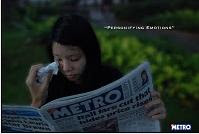
The two Metro ads above imply how the Metro plays with emotions - as if it had wiped the girl's tears or made the boy angry. This is a very effective way in persuading its motive as a newspaper as all readers like to feel as if they are engaged one way or the other.

Metro Ad 6

Metro Ad 7

Metro Ad 8

This is three Metro newspaper poster campaigns in order to promote their newspaper. I like the look of these newspaper posters as they are simple but very effective. I may look into this when planning to create my newspaper poster. Each paper show the Metro logo which shows codes and conventions of each newspaper.  The Metro has also gone for a "laid back" approach in order to distribute their paper, in which the poster of "light reading" I found to be the most effective. The Metro can do this as their newspapers are free and they don't need to sell their contents in order to be read.

Metro Ad 9

The Sun Ad 1

This poster is very simple, as it has no price, no description on what is included or if they are trying to force you into believing their opinions. I think this poster has been made the way it has as they are trying to get everyone interested in reading it as some people might like an unbiased view on news.

The Sun Ad 2

This poster is a receipt with the contents of the sun newspaper as the purchases. The adverts is stating that the reader can get all that above contents for only 30p. This advert is plain but I think it is really effectiveThis advert of the recite represents The Sun newspaper a getting loads for a low price of 30p. The list shows what contents is in the newspaper this tries to appeal to different audiences.

The Sun Ad 3

This is the second Sun poster I have seen. It has a lot more going on unlike the other sun poster. The slogan at the bottom says: "Big Opinions. Every Day", which I think is telling people that they are trying to force their opinion on to you. It contains all the standing elements of a newspaper (dominant picture, slogan/quote/teaser and the newspaper's masthead.

The Times Ad

Really effective in implying that the Times is the only newspaper that reaches diverse audiences and covers a wide range of issues - that there is even an "ocean correspondent".


Generic conventions:
-1 Main image
-Not a lot of text
-Involves the newspapers website
-Eyecatching
-Tells you what is unique about the newspaper
-'Value for money' is a technique used to sell the paper
-General tone is serious
-Pronouns to involve the audience
-Name of the newspaper
-Isn't gender or age specific

No comments:

Post a Comment