Please note that a JPEG file will be on the CD to allow insight into more detail.
Sunday, 29 April 2012
Monday, 16 April 2012
Evaluation Question 4
How did you use media technologies in the
construction and research, planning and evaluation stages?
The camera
and the photoshop software were the most frequent forms of media technologies
used during the stages in the advanced portfolio. In terms of constructing the
newspaper and poster, I used Microsoft office publisher for designing and
applying code and conventions and the standing elements of a newspaper such as
the use of five columns on the front cover and the use of colour. On the front
cover, I used a very high quality Panasonic digital camera with high
mega-pixels to catch very snappy pictures of the three convicts in the court. A
lens helped me to zoom into their faces and catch their facial expressions.
Furthermore, uploading the images on photoshop and then manipulating them in
terms of contrast, sharpness, brightness and cropping. This allowed more
professional and glamorous images. The cropping into the heads and a bit of the
neck gave a celebrity focus onto their facial expressions so that the audience
feel shocked but yet amused.
![]() |
I used a very similar camera to this |
Similarly,
all the photos on page two of the newspaper were cropped and then manipulated
through sharpness, contrast and brightness. However the photos taken on page
two were all simple still images for objects and for posing, still images of
people which were much easier then the photos taken on page one. The woman of
the hair and beauty advertisement had contrast mainly added to her to allow
emphasise on her beauty and cropping allowed her figure from her waist and
above to be shown.
In terms of
research, the internet (being a very simple but effective media technology) was
a guide into constructing the newspaper, poster and radio ad. It provided me to
an insight of many real sample products. For example when I was researching for
how posters were used to advertise and compliment the newspaper, just typing in
“the independent poster ad” would provide the results. These results helped me
in understanding I should apply similar standing elements, codes and
conventions.
For
planning, Microsoft office publisher was very good for trial and error for the
newspaper and poster. I kept constantly changing the font size, the colour, the
size of the text boxes, etcetera, until the codes and conventions would be
organised in a professional way. For example, page two of the newspaper was
very compact with space – just adding one word would change the whole layout of
page two, so adjusting news stories in a perfect sized text box was only
possible through trial and error. Similarly, during the radio ad I used trial
and error for toning the voice of the speaker, formality and speed of the
dialogue through a microphone (connected using USB cable). This was very quick
and efficient in carrying out the radio ad, as it was easy to manipulate.
During the
evaluation stages, I recorded video from the iphone 4 to record my focus group.
Again the media technology of an iphone allowed providing me with on-demand
consumption and therefore it was easy to carry out the focus group. In the
presentation of my blog, a blogging service allowed my product to be reviewed
by large audiences very quickly. The online forum as well as providing
interactivity of posting comments meant that my product was viewed by large
audiences, increasing sales (if published). A blog also presented my advanced
portfolio in a professional and organised way into evidence of how I came about
in constructing the newspaper, poster and radio ad. Additionally, Sony Vegas
Pro Ten is radio software that allowed me to merge the background music of the
radio ad and the dialogue together. Softwares and hardwares are increasingly
increasing in their capacity and their speed, which that merging the two
together was not time consuming at all.
Please note there is an audio presentation of evaluation question 1 on the CD
Evaluation Question 3
What have you learned from your audience feedback?
Generally, I have learned that the structure and layout of my front cover of the local newspaper is carried out in a professional and clear way, especially in the representation of the main news story. However, a lot of people had questioned the white on black effect. This is maybe because the people I had asked did not study newspaper. Also, the masthead was clear for many people..There are arguably too many colours and layout may seem a bit amateur, however, the pictures are very persuasive and attractive. On page 2 of the local newspaper, straight away viewers commented on the amount of text published and amount of news stories. I understood this and had taken this into account that more pictures should be added although it was difficult. However, based on my research into real products, 3-4 news stories on page 2 were consistent. But on the whole again the structure and layout of the page was done in a professional way and the page looks very visually genuine as everything on the page compliment each other such as the colours, stories, pictures and headlines. Furthermore, one person may say my poster for my local newspaper looks like a police magazine whereas another person may say it looks as if it is advertising a poster for a newspaper. Therefore, I brought emphasise to a brand new local newspaper and its price tag to make it more localised. I also placed the newspaper name and slogan on the centre of the poster so that it becomes the central point of the poster and made the image smaller. For the radio ad, generally the dialogue is good and is complimented by the background music but music is a bit loud. However, a lot of people are not familiar to radio compared to print and video. Consequently I carried out a focus group during my production;
Please there are focus group videos on the CD
Evaluation Question 2
How effective is the combination of your main product
and ancillary texts?
The
ancillary texts I constructed promote and compliment the main product. The
masthead of the newspaper is promoted further on the poster to emphasise the
title “Willesden Gazette”. This combination is important so that the audience
familiarise themselves with the new newspaper. The fact that the headline “life
for murder” on the newspaper is occupied on the poster indicates how important
consuming the newspaper is – that even the headline is as important as the new
newspaper launch itself. It also provides a very snappy and yet engaging teaser
by having the main headline as the audience would want to read on. Also, the
newspaper informal slogan, “Gazette-it off” reinforces the idea that the poster
compliments the local newspaper.
Furthermore,
Uncle Sam’s “Your country needs you” was changed in a way that it would suit
knife crime. This pun of words would leave the audience bewildered but amused,
as a poster is meant to play with emotions very suddenly. Uncle Sam’s poster
was created in time of need and desperation. In the same way, the relationship
of knife crime and the urge of tackling it. And of course the construction of
images especially on the front covers of the newspaper and the poster. The
three convicts and the police officer have deliberately been created in a very
glamorous but serious way - a sign to its newspaper’s strong and political news.
So, in this sense a scruffy police officer pointing at you would be effective
in complimenting the stance and police-pro ideologies of the local newspaper.
The
ancillary text (the radio ad) was also effective in the combination to the
newspaper. The title “Willesden Gazette” was the first two words that the
viewer would hear. Towards the end of the radio ad, the title was repeated;
again this repetition promotes the newspaper’s name. Although, the ad was very
simple, the formality and serious tone of the ad reflects its formal and
serious news. Whereas a radio or television ad for The Sun newspaper is a
“joke” along with soft stories like which celeb got kissed. Also, the informal
slogan of “Gazette-it off reinforced the newspaper’s name. The 20p price tag is
again reinforced in the radio ad as people would not pay a lot especially for a
local newspaper. A local newspaper’s whole vibe is to present local issues and
stories. Again this is promoted as the radio ad covers “wide issues ranging
from violent crimes to community regeneration programmes and much more”. The
radio ad acts like a direct conversation between the speaker and the listener
such as being “connected”. In other words not being connected to Willesden
Gazette news is a downfall. Finally, I have deliberately constructed Willesden
Gazette platforms in a formal but amusing way. For example, the pun of words
with “Gazette it off” at the end of the radio ad. This is also typical in the
found in the newspaper. Even the soft background music portrays the fact that
the newspaper is very simple in its design and news and effective at the same
time, just like the music.
Furthermore,
the ancillary texts are not only effective in complimenting the newspaper, but
work to complement each other. The poster and radio ad both emphasise on the
title “Willesden Gazette”, the brand new launch date/day and the unlimited
supply of news, issues and information. Both work well in terms of advertising
the main product.
Please note there is an audio presentation of evaluation question 2 on the CD
Evaluation Question 1
In what ways does your media product use,
develop or challenge forms and conventions of real media products?
Newspaper:
Mastheads, skylines, straplines,
headlines, white on black, bylines, body text, sidebars, menus, pull quotes,
puffs and captions are all typical codes and conventions that real newspapers
follow, especially on the front cover. My local newspaper’s masthead is bold
and large and therefore able to catch the audience’s eye and get them
interested in my newspaper, including the date, website and price. Through
research into real products, the masthead noticeably covered a quarter of the
space on the front cover. Similarly, I applied this convention into my
newspaper. The title represents the newspapers identity and personality. I
rejected the traditional icon of black on white (typically broadsheet) or white
on red (typically red-top tabloid) and went for a mixture of the two to
symbolise a mid-market touch to the newspaper (although it’s mainly for the
lower middle class/higher working class: “Willesden” being black on white and
“Gazette” being red on white. Analysis of a range of local newspapers
constructed the title of my newspaper. It is almost impossible to find a local
newspaper without its local area name in its masthead, hence, the construction
of “Willesden”. Local newspapers follow a sans-serif typeface in their title
and masthead to connote informality and news stories and captions follow a
serif typeface of an equal and small font. Likewise, my title and masthead was
of an aerial font and the rest was times new roman.
Additionally
the term “Gazette” adds this journalistic flare to the whole personality to the
newspaper. Developing a headline introduces the title of the lead story or
splash. This is usually carried out in a condensed black font. However the
white on black effect allowed dramatic emphasis on the story. It is something
unusual for the audience to witness, so therefore will definitely be intrigued
as to what the story is about. The headline itself, “Life for murder”, is very
simple but damaging. I had purposely created this convention because big news
stories in local newspaper follow the same convention. An additional strapline
gave a taste of what’s to come in the story which is a modern convention as
well as a byline (in bold type), indicating its authenticity to the story.
Furthermore, a sidebar column separated from the main body text, allows viewing
for short teaser stories on inside pages or news in brief. An example of this is
a sneak peak of a headline in the sidebar “onions for laptops”, followed by a
teaser story.
Furthermore
I used and developed the images/photographs of the three Afro-Caribbean males
on the front page, with an additional caption of their names below. Although it
was difficult, I managed to glamorise the images itself without editing it
through the connotations of their facial expressions. Pulling of a symbol to
the audience, we as consumers are intrigued and attracted to such intimidating
but yet “I don’t care” images. Through the majority of mug shots in local
newspapers, the connotations I had found in these photographs is that the
individuals have this “I don’t care” look. And the captions/names below the
murderers add a sense of reality.
Furthermore,
through research the local newspapers I analysed followed a format of a
tabloid-sized newspaper (approximately 23 *43cm) consisting of 5 columns for
the front cover and 6 columns for page 2. During the research I had come across
some design tips that helped me develop the conventions I created.
·
All
story packages should be should be shaped like rectangles (all my news stories
on both pages follow these codes).
·
Every
page should have a dominant photo or artwork (on the front cover, the 3 Afro-Caribbean
males and page 2, the class and the teacher).
·
Every
story must have a headline (essential standing element that my newspapers
covers where every news story is followed by a headline)
·
Every
photo must have a caption (again an essential standing element my newspaper
covers as there is a caption for every photo)
·
Use
no more than three typefaces per page, including the typeface in the nameplate.
·
Headlines
should get smaller as you move down the page (local newspapers, especially
after the front cover have one main dominant news story consisting of a main
headline and photo. The other headlines and news stories surrounding are much
smaller in size)
Although
local newspapers have strong advertising services, I deliberately kept the size
and number of advertisements as minimum and as small as possible, as the
examiner prefers us to show of our journalism in news stories, hence why I
created one hair and beauty advertisement on page 2. However, advertising is
large part of a local newspaper which drives local businesses and is a
convention of real products. Sometimes it even covers half of the front cover
and page 2 such as the Harrow Times. In terms of the “missing person”, “contact
us” and “Gazette weather”, again I kept it as minimum as possible taking up ¾
of a column. It is still a typical week in and week out convention that most
local newspapers follow. To make my newspaper look more realistic and not just
covered with a splash of news stories, these conventions were part of the page
2. The opinion poll about “rising fare” on page 2 is again another convention
that some local newspapers abide to so I managed to interview 5 people about
their opinions. In terms of news stories itself, from following real products
front covers typically seem to contain one very dominant story or one dominant
and a lesser dominant story next to it. On page 2, there are a variety of 3-4
news stories in real samples so I similarly applied 5 news stories to my
product.
Please note there is an audio presentation of evaluation question 1 on the CD
Final Radio ad Planning
- Keep radio ad 30-40 secs minimum
- Do not copy theme music - make it original
- I feel soft piano would be most suitable to the tone and simpleness of the radio ad.
- Length of background music should be longer then dialogue starting with a fade-in and ending with a fade-out, to add more professionalism to the radio ad.
In terms of dialogue;
- Shorter in length compared with background music but fit it music when required, in a way it does not bore the listener
- Tell speaker to stress on every word making it clear and understandable
- Tone and pitch voice accordingly, for example, at the start of the ad, it is most likely a high/loud pitch tone will engage the listener
Radio Plan 2
Background music
Music 1?
· Now we are Free - theme song - planet earth video
· Gladiator Theme (Now We Are Free) Violin
Opening of radio ad?
· 10 second Time Bomb (analogue version) sound effects
· "Now We Are Free" - Gladiator Soundtrack Theme (Piano and Guitar)
· Pirates of the Caribbean - Incredible Piano Solo of Jarrod Radnich Filmed by ThePianoGuys
· Piano Solo: Now We Are Free 1.03 -1.50 mins run time
Background music 2?
· Lower volume then dialogue in radio add
· “Willesden gazette. A new newspaper, a local forum with local news and local voice. The best content of a quality paper, immaculately designed and locally focused, all for just 20p. Covering wide issues ranging from violent crimes to community regeneration programmes and much more. On Thursday, make sure you don’t miss your first copy, to remain informed and be connected. Willesden Gazette, Gazette it off?”
Radio software – Sony Vegas Pro Ten
Radio Plan 1
Background music
· Now we are Free - theme song - planet earth video
· Rule Britannia - Patriotic British song 19 secs - 53 secs
·
· Running time up to 32 secs
· Lower volume then dialogue in radio add
Dialogue
· “Willesden gazette. A new newspaper...with local voice...local news...local truth...local news and local forum. The best content of a quality paper, immaculately designed and locally focused, all for just 20p. Covering wide issues ranges from violent crimes to community regeneration programmes and much more. On Thursday, make Willesden Gazette, gazette it off?”
Radio software – Sony Vegas Pro Ten
A Radio ad for my Local Newspaper
Because it was very difficult to find a national newspaper ad, let alone a local newspaper radio ad, I researched into newspaper advertisements that can get away with an audio outlet;
The Independent ad
The "don't do" list sounds very aggressive even though there is a hidden meaning to it - that people have their own freedom and say in its contents as it is owned by no-one . Also, this goes very well with the soft piano in the background. So, clearly my understanding from this advertisements is that the radio ad should have a powerful if not strong start for attention or meaning of a particular subject and how important it is that the background music and dialogue compliment each other.
The Sun ad
Sometimes it does not even require background music - a mixture of voices adds to the theme. The mixture of dialogues and ongoing, correlating conversations about subjects within The Sun is very useful in advertising its ideas and gossip. Also, it was topped up by a freebie to attract the viewer further. Then the newspaper name at the end, reinforced with its slogan added to the establishment of the newspaper.
The Daily Mail ad
This advertisement is solely on its introduction to the new freebie adding to the marketing techniques ,increasing its consumers. The description and yet exaggerated TV listings magazine was the main focal point of the ad. I should bear this technique in my mind whilst constructing the radio ad - the dialogue should be meaningful and have a purpose.
The Guardian ad
Although it is quite long for an advertisement, the very engaging narrative and dramatic sound effects automatically engages the listener. Then the different herd of voices, even in different languages creates confusion and interest - as if almost the ad is expressing world connectedness and involvement.
Poster Test Shots
The the body language and facial expression of the picture is very serious and dominant - as if the the subject is directly referring to you. I had deliberately manipulated Uncles Sam's recruitment propaganda poster, along with a catchy slogan. The first picture was the original picture taken via a camera and I then had to consequently play with cropping, brightness, contrast and colour, which was carried out on photoshop. Also, this picture implies the newspaper is very political in a way as it may seem police pro and therefore hold strong opinions, especially when the local newspaper front cover is about knife violence.
Saturday, 14 April 2012
A Poster for my Local Newspaper
To start constructing my poster for my local newspaper, I needed a clear understanding of how the ideology, representation and genre are conveyed in advertising their newspaper. It was very difficult in searching for posters for local newspapers so I resulted to national British newspapers.
Something that I've found is that there is a basic formula needed when it comes to advertising, as the whole point is for your product to get noticed, and if it looks similar to everything else then it blends in and goes unnoticed, which completely defeats the point. It is also best if the poster is non gender-specific, doesn't include people and isn't age specific.
The Guardian Ad 2 Well the ad speaks for itself - that shouting doesn't necessarily make your being heard. There is a clever play of words which is aimed for the middle-class. |
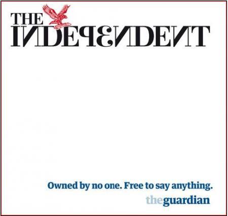
The Independent Ad As simple as it gets. It conveys its message that it is not aimed at any age or group or gender in particular. Slogan is short and snappy. |
Metro Ad 1 |
Metro Ad 2 |
Metro Ad 4 |
Metro Ad 6 |
Metro Ad 7 |
Metro Ad 9 |
Friday, 6 April 2012
Subscribe to:
Posts (Atom)